Metamerism: Why Your Paint Colour Didn’t Turn Out as Expected
As a designer and artist, metamersim is a colour perception phenomenon I have undoubtedly been aware of. Now, you’re probably thinking, what the heck is metamerism?

AVOID COSTLY (AND UGLY) DESIGN MISTAKES

Before I answer that question, I wanted to bring up why this is the topic of this week’s blog post. This past week, I was in the process of paining a mural for my client’s Airbnb room. I’m a very hands-on designer and artist. When working on one of my interior design projects, I often paint, create art and do whatever I can with my own 2 hands.
The backdrop for this mural was planned to be a powder blue.
When paint colour selection goes wrong…
Now, I usually choose paint colours by analyzing paint chips and paint swatches in the room to make sure I am perceiving the colour in the right light (more on this process later). However, in this case, I decided that I would get a custom paint colour match of the blue from the bedsheet covers already purchased. So, I thought, “Well, this makes my job easy, the colour will be exactly as this blue appears!” Wrong. Sometimes, it’s like I need to learn interior design rules all over again.
Anyway, I went to the hardware store and got the colour matched. The paint swatch looked perfect in the store.
So, I started to paint the colour on the walls and immediately noticed the colour appeared to be completely different. The colour looked like a dark purple rather than powder blue.
I thought to myself…darn, I shot myself in the foot by skipping the steps I usually take to ensure the paint colours look as expected. I should have known better.
So, I paused for a second and thought of getting a new paint colour. But then I looked up. I looked up at the light bulbs in the room and realized the bulbs were admitting yellow light. I felt like I was having a major blonde moment up until this point (I am a brunette, so this really should not have been happening).
BINGO. The awful dim yellow lights were adding so much warmth to the space that the blue was being perceived as purple.
I ran to the hardware store to get some white light bulbs. As soon as I swapped the bulbs in the space, the paint colour showed up as expected.
As a designer, I have heard stories from my clients very similar to this one. Especially when it comes to blue and grey paint colours. Plenty of times my clients picked out what they thought to be a grey paint colour only to end up with a blue.

You see, there are steps to selecting a paint colour to ensure the colour turns out as expected. You should not just wing it. Even with years of experience like me, I proved that you still need to take the right steps to achieve the desired colour in a room.
So back to the question and topic.
What is metamerism?
Metamerism is the reason why your paint colours don’t turn out to look like the paint chips in the store. Yes, there is an actual phenomenon and explanation for this!
Metamerism is a phenomenon in which two colours appear to match under one set of lighting conditions but not under another. This optical illusion occurs because of differences in the spectral composition of light. In other words, colours can change their appearance due to the quality and quantity of light that falls on them.
How lighting changes colour perception
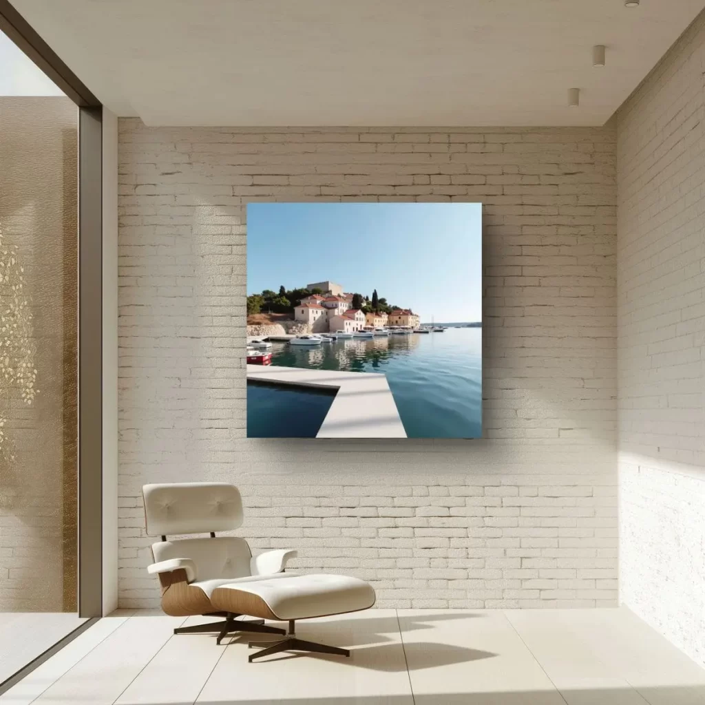
To understand metamerism, we need to grasp how light works. Natural light, such as sunlight, contains a full spectrum of colours. However, artificial lighting, like fluorescent or incandescent bulbs, emits a limited spectrum. When we view an object, we perceive the colours based on the light that illuminates it.
For instance, imagine a red apple. Under direct sunlight, it appears vibrant in colour. However, when you view the same apple under indoor fluorescent lighting, it might appear less saturated or even slightly different in hue. This discrepancy is a classic example of metamerism in action.
Types of metamerism
There are two primary types of metamerism:
- Illuminant Metamerism: This type occurs when the colours of an object appear to change under different lighting conditions. For instance, a red shirt may appear different in colour when viewed indoors under artificial light compared to when it’s seen outside in natural daylight.
- Observer Metamerism: This type involves differences in the human observer’s perception of colours. Individuals with variations in their colour vision, such as colour blindness, might perceive colours differently from those with normal colour vision. An object may look different to two individuals who see colours differently.
Simple steps to ensure your paint colour looks as expected
So now that you understand why your paint colour did not turn out as anticipated, I am sure you want to know what steps you can take to ensure that the next room you paint comes as desired.
Step 1: Compare different paint chips in the space
Let’s say you want to paint your room the perfect shade of beige. You don’t want it to be too warm, you don’t want it to be too cool. I am sure you’ll read plenty of blog articles to get inspiration for some colours you could use. Although it might be easy to just wing it and hope for the best, as you read in my intro story, you might not be pleased with the outcome.
So, visit your local paint store and get about 7-15 different paint chips of colours that look close to what you are trying to achieve. Once you get back into the space, place the colours down on the floor and start to compare. Once you lay all these paint colours next to each other, the colour’s undertones will really start to pop. You’ll notice that some of these beige colours contain a lot of pink, yellow and green. Take a look at how the colours interacts with your flooring and the other items in the room. Notice which colours look harmonious with the other colours in your space.
From there, you should be able to narrow down your selections to 3-5 contenders.
Step 2: Paint swatches and observe the colours in different lighting
Once you’ve done your preliminary paint chip test, it’s time to paint some swatches on the walls. Get some sample paint pots and paint each colour next to each other on each wall. This is important because you want to see the colours in different parts of the room.
Then, you want to observe these paint patches at different times of the day. Check in the morning, afternoon and evening to see how you like the colours.
Also, evaluate your light bulb situation. If you’re unhappy with your light bulb colour, change these out before you make a paint colour decision. Because, as we have learned, the artificial lights in the room make as much if not more impact on the colour than the natural light.
Step 3: select your paint colour informed and CONFIDENT
Once you have observed all the different paint patches in the space, you can proceed with confidence that the paint colour you choose will appear as desired in your space.
If you need more assistance or are still unsure, I would recommend consulting with a designer to ensure you’re making the right decision for the space. After all, repainting ain’t cheap. Contact me. View eDesign services.
The science behind metamerism
The science of metamerism lies in the way our eyes perceive colour. Human vision is based on three types of colour receptors in the retina, known as cones. These cones are sensitive to different parts of the visible light spectrum—red, green, and blue. Our brain interprets the signals from these cones to create the full spectrum of colours we see.
When light of a specific spectrum stimulates these cones, our brain processes it as a particular colour. However, when the spectrum of light changes, it can stimulate the cones differently, leading to a shift in the perceived colour.
Metamerism is a captivating aspect of colour perception, revealing the intricate relationship between light, the human eye, and our interpretation of colour. Understanding metamerism is crucial in various industries to ensure consistent and accurate colour representation. It also adds another layer of complexity to the world of colour, making it an intriguing subject for anyone interested in the science of perception and aesthetics. So, next time you notice a colour change under different lighting, you’ll know that metamerism is at play, offering a fresh perspective on the beauty of the colours that surround us.
Let’s design your space together, virtually.